That One Time I Invented a Fictional Pop Artist to Create Branding For
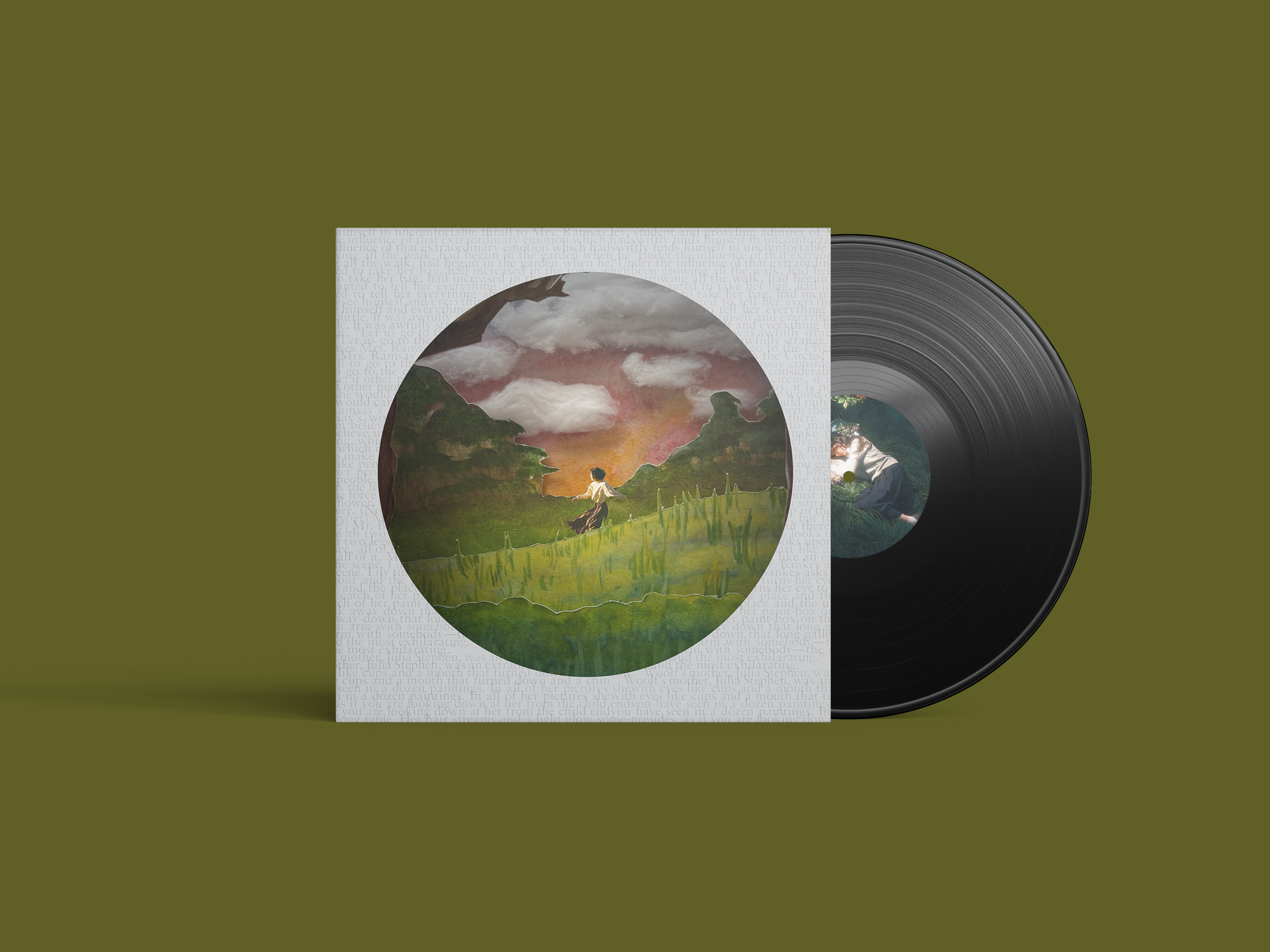
Vinyl mockup featuring the Late Afternoon album cover, with a layered paper landscape of green hills, sunset, and a figure walking through a field.
Hey partay people! Welcome back to the blog! I am quite still new at this so anything I write as an intro will stress me out, so please bear with me~ Today I will be diving deep into a fun little branding project I did— and yes this is a project that is indeed exclusive to the blog so you are in for a treat…! I hope lol..
Whenever I’m asked what my favorite type of graphic design is, the question always brings me to think about every type of design out there, from the road signs for famous landmarks that pass by every now and then, to the logo for the restaurant people get excited over; the possibilities are endless. My favorite type of design has always been branding for new album rollouts for music artists, because rather than relying on one static conventional identity meant to stay consistent, this type of branding allows for artists to essentially reinvent their visual world with each album and its era. Album branding and the designs surrounding it are a huge tool to convey the storytelling or aesthetic to an audience, and are one of the most important parts of marketing for albums. It’s everywhere! Imagine about a time when your favorite music artist’s website mysteriously changes the entire aesthetic out of the blue to gather excitement and anticipation for a new release. You’ll look for the main colors used in the backgrounds, analyze the imagery, the merch, and even judge the font chosen for much of the typography. It is so fun to figure out what types of songs will be in the record just based on the rebranding alone, and it is even more fun to see how an artist’s branding shifts from era to era.
For instance, my favorite recent album rollout has been seeing the shifts in branding for Olivia Rodrigo’s new album, you seem pretty sad for a girl so in love (so real btw), and how different it all is from her previous record, GUTS.
In GUTS, we were given themes of grunge, punk rock, retro, and scrapbook elements. Imagery in GUTS relied heavily on juxtapositional elements, depicting something that seems unpleasant or uncomfortable (hence the name of it being GUTS) thrown together with almost fantastical and pretty elements. My favorite of this was the graphic used for her tour promos for this era, which was her essentially throwing up sparkles and stars. In girl so in love, the branding almost makes a complete 180. Instead of messy, grungy elements, the brand identity for girl so in love utilizes romantic, feminine, and dreamy elements sourced from mixed media textures like hand-drawn art, fabric textiles, and paper dolls. In a world full of AI, it was so refreshing to see the branding of this album use human-made artwork, perhaps to communicate the raw and complex feelings of being in love. That's what makes branding so fun: picking and choosing what elements or references to draw from to reflect the music in an album leaves room for so much creativity and inspiration.
Okay, Now For the Actual Subject of this Blog Post
Now why am I going on and on about music artists and Olivia Rodrigo and branding? Well, earlier in my last semester of college, our class was tasked with a large branding project for anything of our choice with a quick turnaround time to simulate hard deadlines and juggling multiple deliverables, with no parameters at all, meaning we got to pick or invent anything we wanted to brand. Soooooo obviously I HAD to use this moment to… basically invent a fictional music artist and create a brand identity based on a fictional album rollout! I mean, I couldn’t help myself; as a design student, it was something I had to do.
When deciding what I wanted to do for this project, I had a really hard time choosing a story to tell and how the artist would frame the branding. After all, the music industry and market is so saturated, so coming up with a concept proved to be rather daunting than anything else. After doing some research on different music artists’ branding for album rollouts by scale of popularity, I settled on creating a new and upcoming indie pop music artist to balance (and put less pressure on) the branding aspect… If you’re getting what I’m saying (I lowkey don’t; PLEASE DON’T KILL ME).
Please Welcome Indie Pop Artist, Iris Bellgarden!
Soooo, the big idea was to give a newly invented pop star, Iris Bellgarden, a storybook-inspired, earthy, and nature-centric branding for her theoretical album called Late Afternoon, focusing on folklore, peaceful, and nostalgic themes. The branding would include many storybook elements, playing around with drop-cap-styled logos for her identity name, and framing the branding for the album cover to be based on layered illustrations that are usually seen in children’s fictional books.
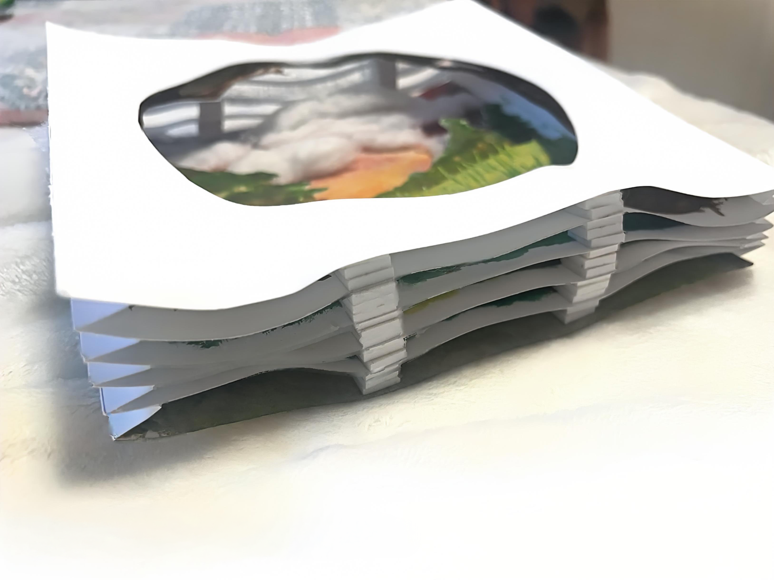
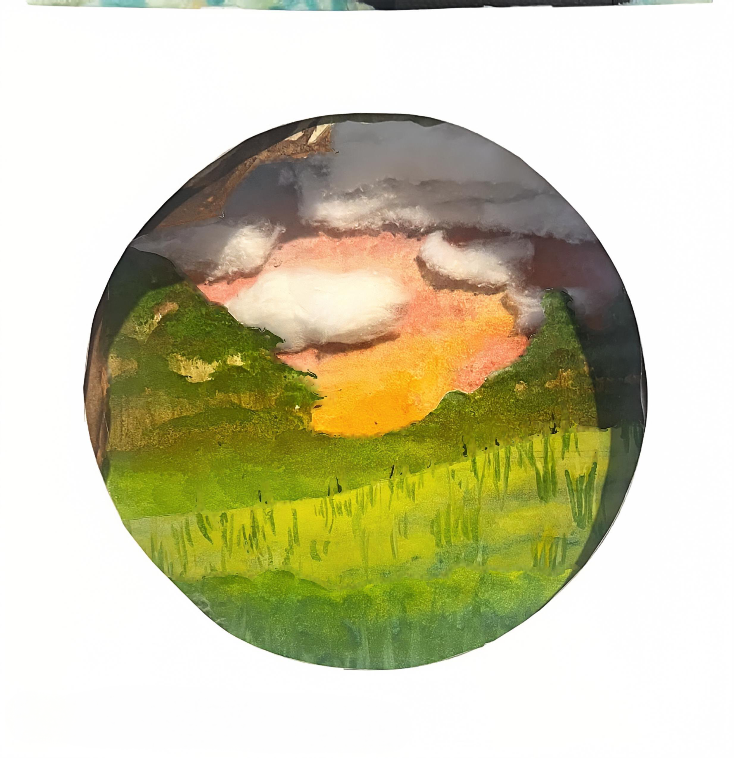
Interestingly enough, I made a point to my professor that I wanted to incorporate some mixed media in the creation of the branding before anything about Olivia’s new album came out (sooo therefore I should be hired on her team because I am a psychic), so the album cover itself was actually created by utilizing a multilayered paper photo tunnel, which is a selected amount of frames of a scene all spliced into foreground, middle, and background frames to give a 3D quality to it, depicting lots of hills and trees under a sunset, with cotton balls as clouds. I had been making so many paper crafts that month, so I really wanted to incorporate that into my design. Having the paper-like quality for each of the layers gave a reminiscent feeling of storybook covers. I had so much fun creating the photo tunnel for this album, and seeing it come to fruition and mocked up on vinyl and CD covers was so mesmerizing!
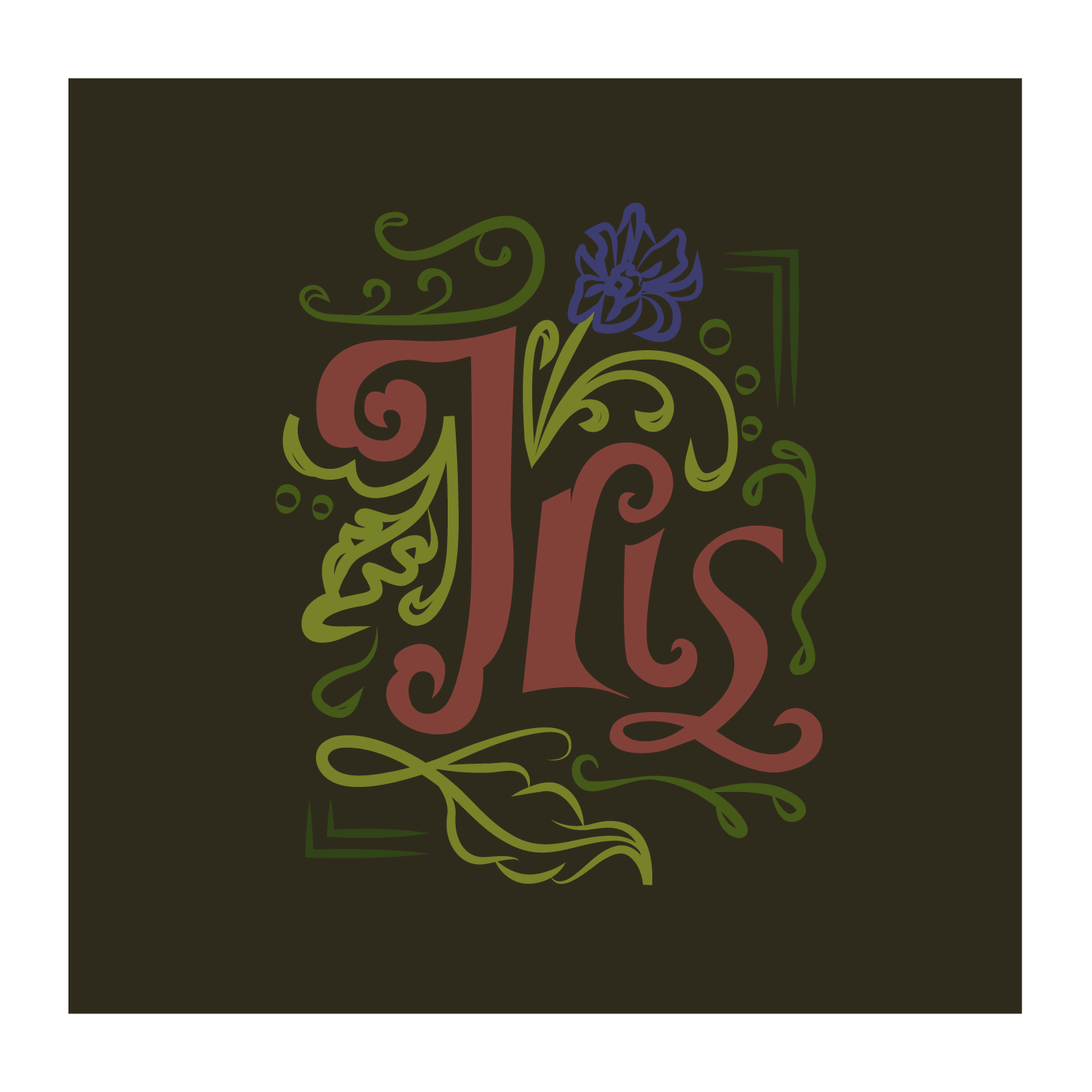
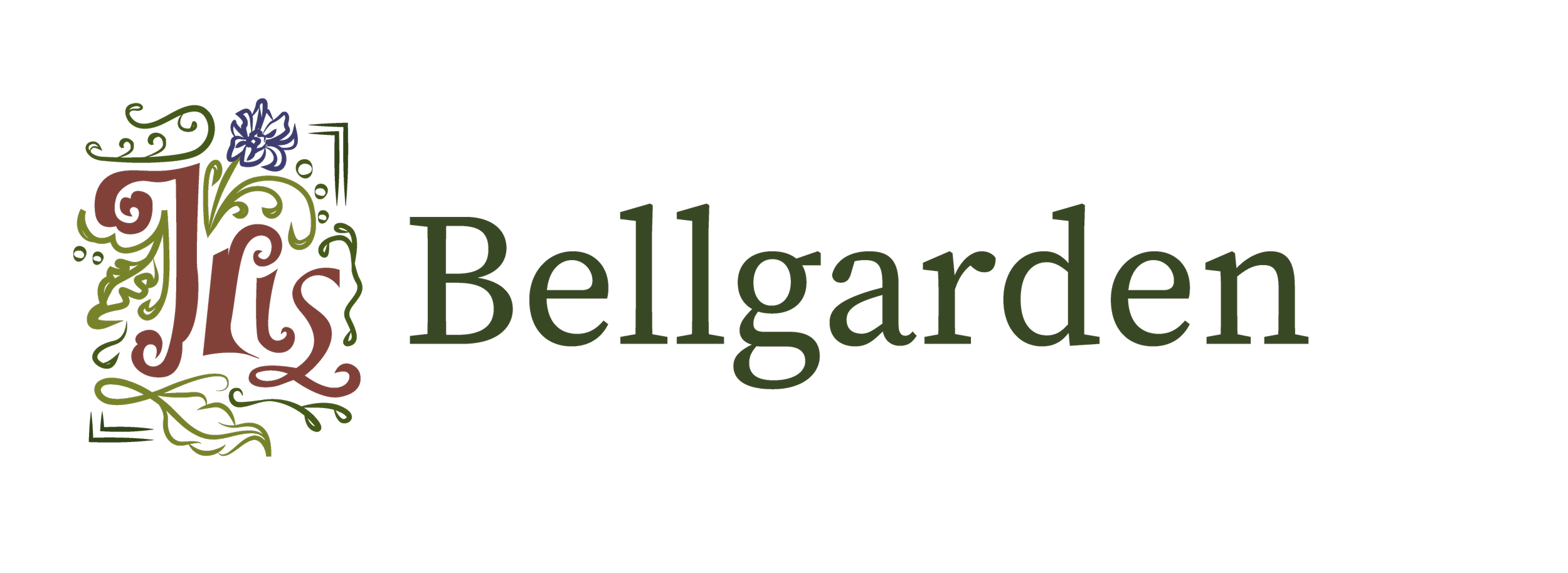
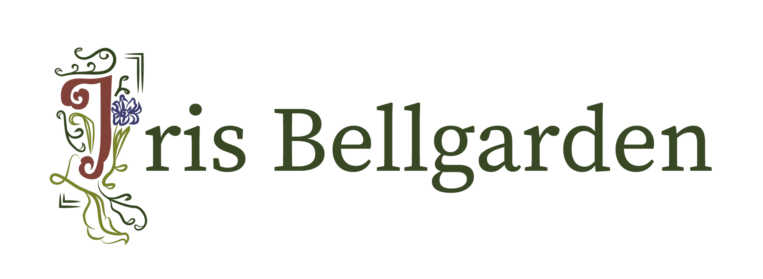
For the wordmark for Iris’ album era, I was inspired by the stylization of drop caps (like that SpongeBob meme of him spending so much time trying to write an essay and ending up with just “The” on his piece of paper) used in storybooks, and I thought it was perfect to frame her identity wordmarks with this idea in mind. As you can see below!!

After solidifying all of the brand elements for this project, I wanted to expand and explore other layout systems for potential deliverables, so I made a mockup of the fully photoshopped album cover and slapped that on a vinyl cover mockup, which is always one of my favorite parts of designing a project. To see it come to life always makes me feel like I’m a girlboss designer.
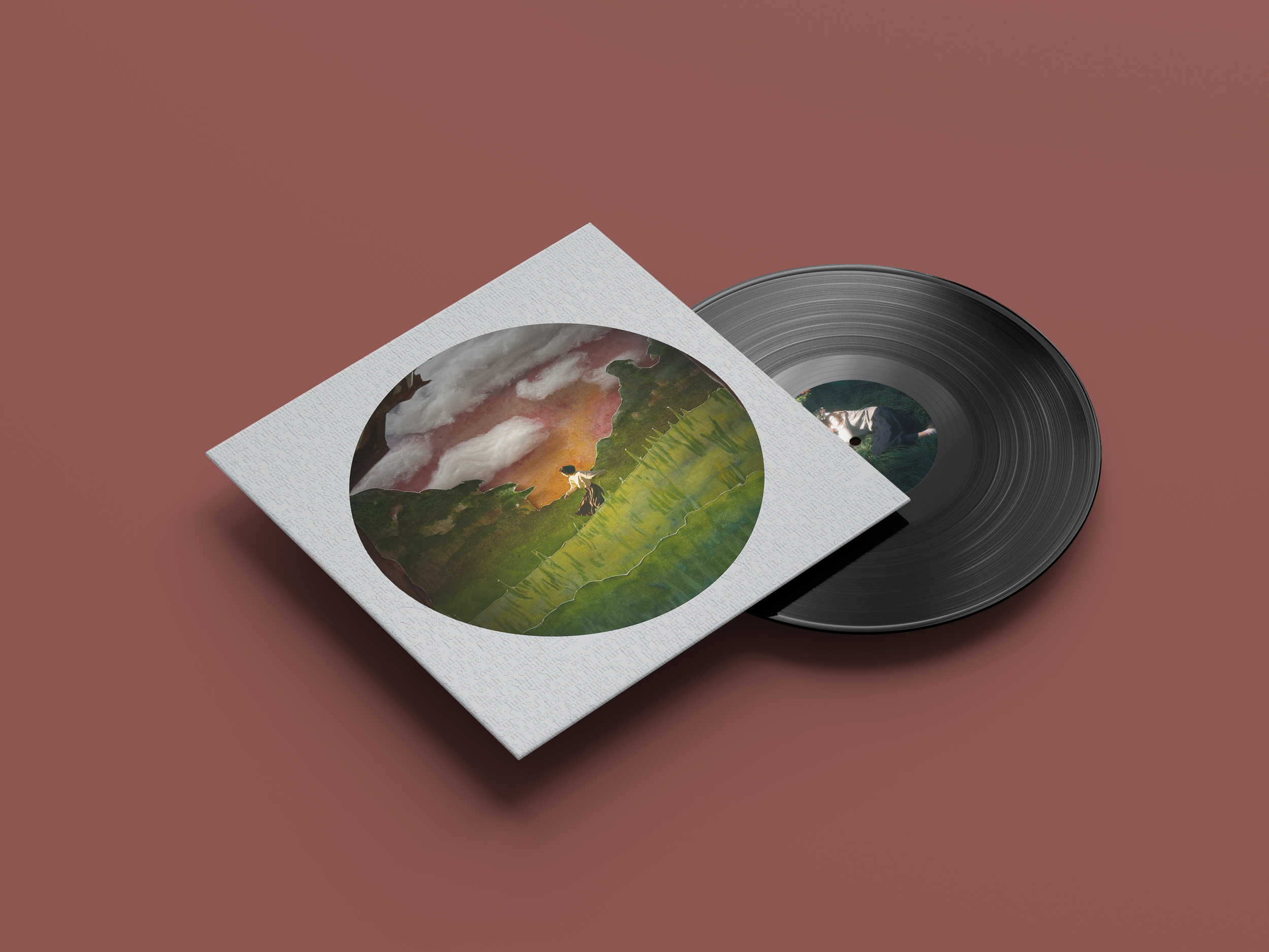
Vinyl mockup for Late Afternoon Alternative
I also wanted to explore other layout systems, like how I would utilize typography on CD material, so here’s the full mockup of a CD version of Late Afternoon!! I quite enjoyed splitting up the titles with the first words having their own column, just to further push the idea of a table of contents in a storybook. Very fun to do!
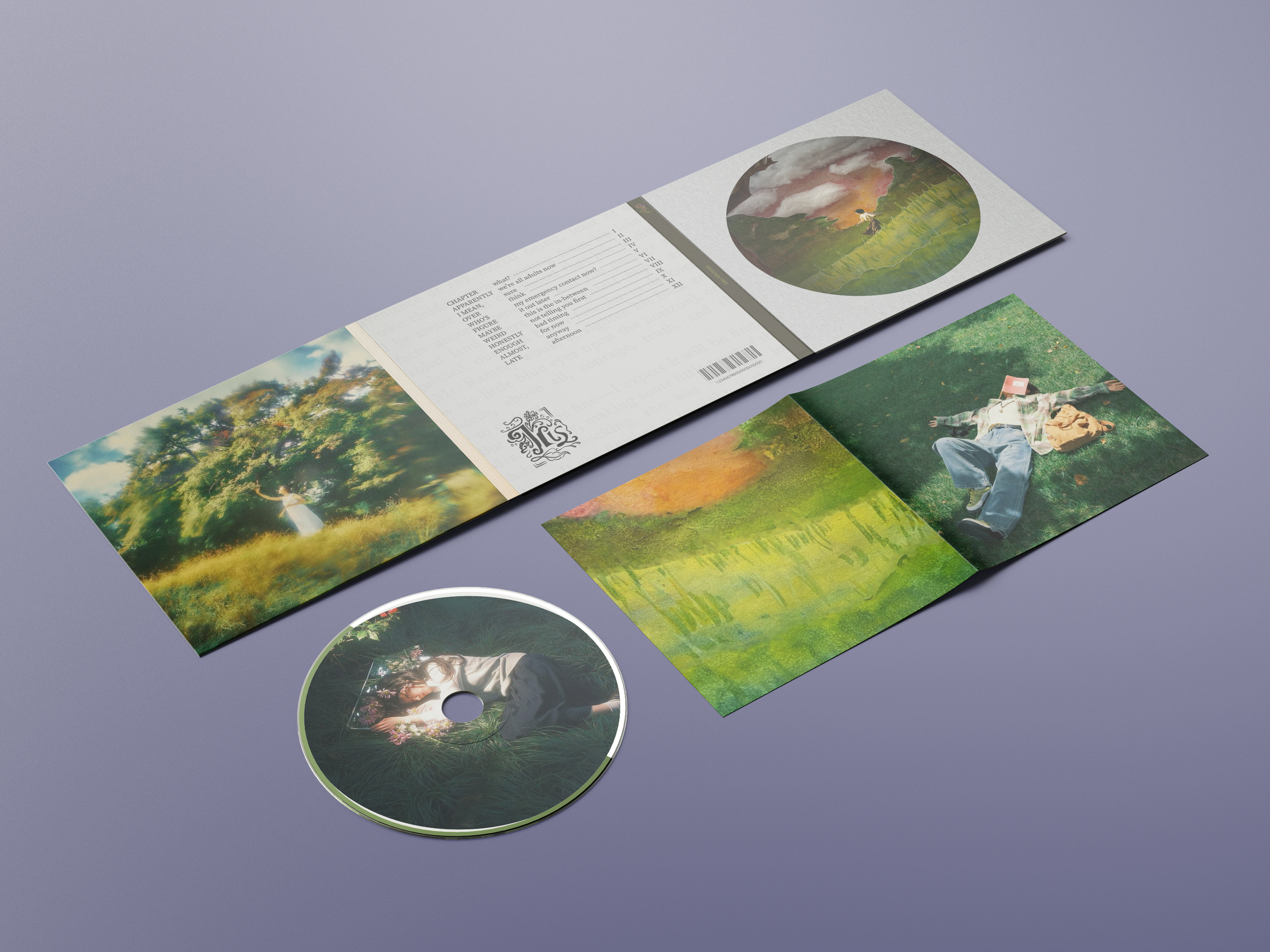
CD mockup for Late Afternoon
Lastly, we had to create a landing page for our project ideas, so here is what a potential landing page would look like if Iris truly was a real human with an album coming out PLS
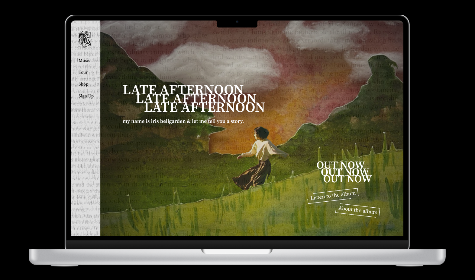
LATE AFTERNOON WEBSITE
“my name is iris bellgarden & let me tell you a story.”
The Final Verdict
Late Afternoon ended up being one of my favorite projects I did while in college, just because it is a dream of mine to be on a marketing/design team for a mainstream artist— like imagine marketing for Chappell Roan— or even elevating a small artist’s branding, there is so many possibilities to explore with design when it comes to all of them.
Anyway, thx for reading, and if you made it this far, I truly appreciate it, even if my writing is goofy PLSS— IM NEW and its lowkey really hard to talk about these projects having lived and basically given birth to them (is that too morbid?). It’s almost like trying to write about someone’s full life, like I know what I made but it’s so easy to jump from this to that when I get too excited… SO PLS GIVE ME SOME GRACE~
In the next installment of this goofy blog, I will be taking you on a dramatic journey on about how I redesigned a logo for the Institute of Electrical and Electronics Engineers organization at my college (that was JUST accepted this week!!!!), the University of Oklahoma, and how I turned it from a (what the actual college athletics department said) logo that was giving “OU athletics copycat” to a retro-styled badge, pulling inspiration from the Fallout games… and somehow incorporating a tornado in between…! This was a year long development, and I can’t wait to put the pen on da paper and show the literal hundred amounts of different types of logos and ideas before settling on the final product. See u then!
toodles,
~ Heather